INSTITUTO BALLESTER
Education first. Connecting family and Institution.
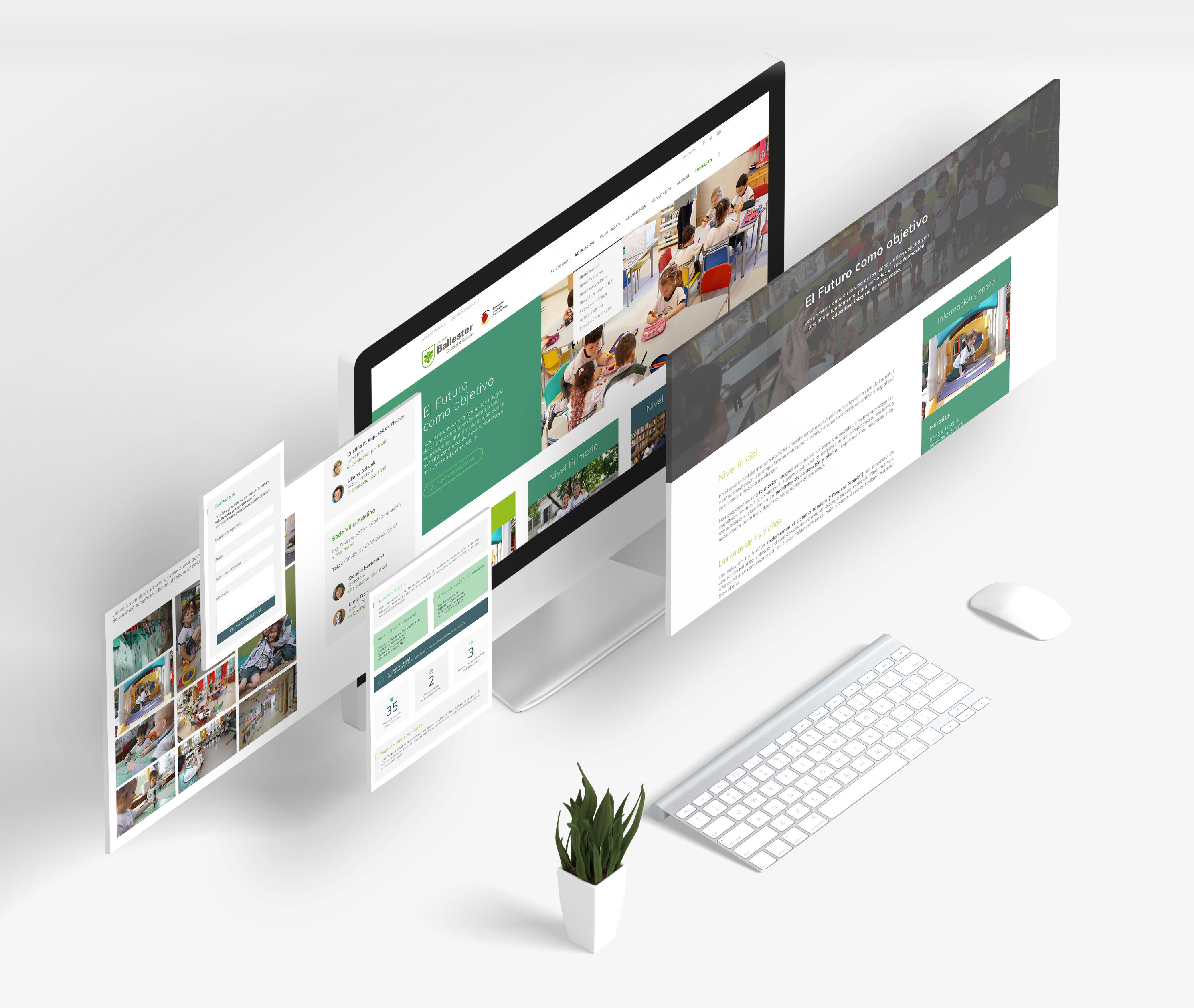
Educational Institution Website.
Challenge
A lot of content for many types of users.
Know the users and their goals. Rewrite content for them. Create a simple interface according to each need.
Solution
Solid Information Architecture and Landing pages.
We created a solid information architecture and redirect users to landing pages by different types of menus, call to actions and banners.
Scope
Information Architecture
Interaction Design
Front-end Development
The process
Creating Personas
Part of our design process is to understand users’s needs, experiences, behaviours and goals. Creating Personas help us to standardise needs and get solutions faster.
In this case, the client has a very different types of personas, and we had to focused on: Parents (already in the Institution), Parents (searching for an Institution), Teachers. Dividing users in this three categories, we understood what content and call to actions we had to add in order to redirect each users to the right content.
Card Sorting
One of the UX goal is that the users finds what they’re looking for. Card Sorting serves to create an information architecture that matches users’ expectations.
We selected a total of 50 users to work with Card sorting. They made a great work, with usefull questions and comments about issues regarding the current website. We analyze all the data and create a simple and user-centered information architecture.
Wireframing
One of the advantages of wireframing is that it gives an information structure that can be used to review with the client. It’s also very simple and quickly to make changes on the wireframes and it’s the best method to start a prototype or a visual design with the structure and content approved.
We have made +10 wireframes for this project: Home, Landing Pages, and 5 different types of pages. Also, using Adobe XD, we created a simple users flow in order to confirm the process with the client and start the Visual Design.
Visual Design & Development
The more exciting part of the process.
We started the design basing on the Brand Guidelines. We added two more colors on their pallet and changed the web font to make it more legible and usable to all devices.
We develop the site using WordPress.
